In the world of digital marketing, driving traffic to your website is only half the battle. Whether that traffic comes from paid ads, social media, email marketing, or organic search, its ultimate value depends on what happens after the click. This is where landing pages come into play. A landing page is a dedicated, standalone webpage designed with a single, focused objective: conversion. However, simply having a landing page isn’t enough. To truly capitalize on your hard-earned traffic and maximize your return on investment (ROI), you need to engage in Landing Page Optimization (LPO). This comprehensive guide delves into the essential elements required to create high-converting landing pages.
What Exactly is a Landing Page?
Unlike your website’s homepage or other pages designed for exploration, a landing page is laser-focused. It’s built specifically for a marketing or advertising campaign and aims to persuade a visitor to take one specific action. This action, known as a conversion, could be anything from:
- Making a purchase
- Filling out a lead generation form (e.g., for a quote, demo, or consultation)
- Downloading a resource (like an ebook, whitepaper, or checklist)
- Subscribing to a newsletter
- Registering for a webinar or event
- Starting a free trial
The key characteristic is its singularity of purpose. Effective landing pages minimize distractions (like site navigation) to keep the visitor focused on the intended conversion goal.
Why is Landing Page Optimization Crucial?
Landing page optimization is the systematic process of improving elements on your landing page to increase the percentage of visitors who convert. It’s not about guesswork; it’s about understanding user behavior and making data-driven decisions. Here’s why LPO is indispensable:
- Improved ROI: Optimizing your landing page means you get more value (conversions) from the traffic you’re already paying for or earning. This directly boosts the ROI of your marketing campaigns.
- Lower Cost Per Acquisition (CPA): By converting more visitors, you effectively lower the cost of acquiring each lead or customer. This is especially critical for paid advertising campaigns (like Google Ads or social media ads).
- Enhanced User Experience: A well-optimized landing page provides a clear, relevant, and easy path for the user to get what they came for, leading to a more positive interaction with your brand.
- Better Ad Performance (e.g., Quality Score): Platforms like Google Ads reward advertisers whose landing pages provide a relevant and positive experience. LPO can improve metrics like Quality Score, potentially leading to lower ad costs and better ad positions.
- Valuable Customer Insights: The process of testing and optimizing reveals valuable information about your target audience’s preferences, motivations, and pain points, which can inform broader marketing strategies.
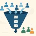
Build your own digital marketing funnel
Take your marketing to the next level!
The Cornerstone: Message Match
Before diving into individual elements, it’s vital to understand the concept of Message Match. This refers to the consistency between the message that drove the visitor to your landing page (e.g., the ad copy, email subject line, social media post) and the message presented on the landing page itself. Poor message match is a primary reason for high bounce rates and low conversions.
If your ad promises a “50% Discount on Blue Widgets,” your landing page headline, copy, and visuals must prominently feature that exact offer for blue widgets. Any disconnect confuses the visitor and erodes trust, causing them to leave before converting. Ensure your headline, subheadline, copy, and visuals directly reflect the source that brought the user there.
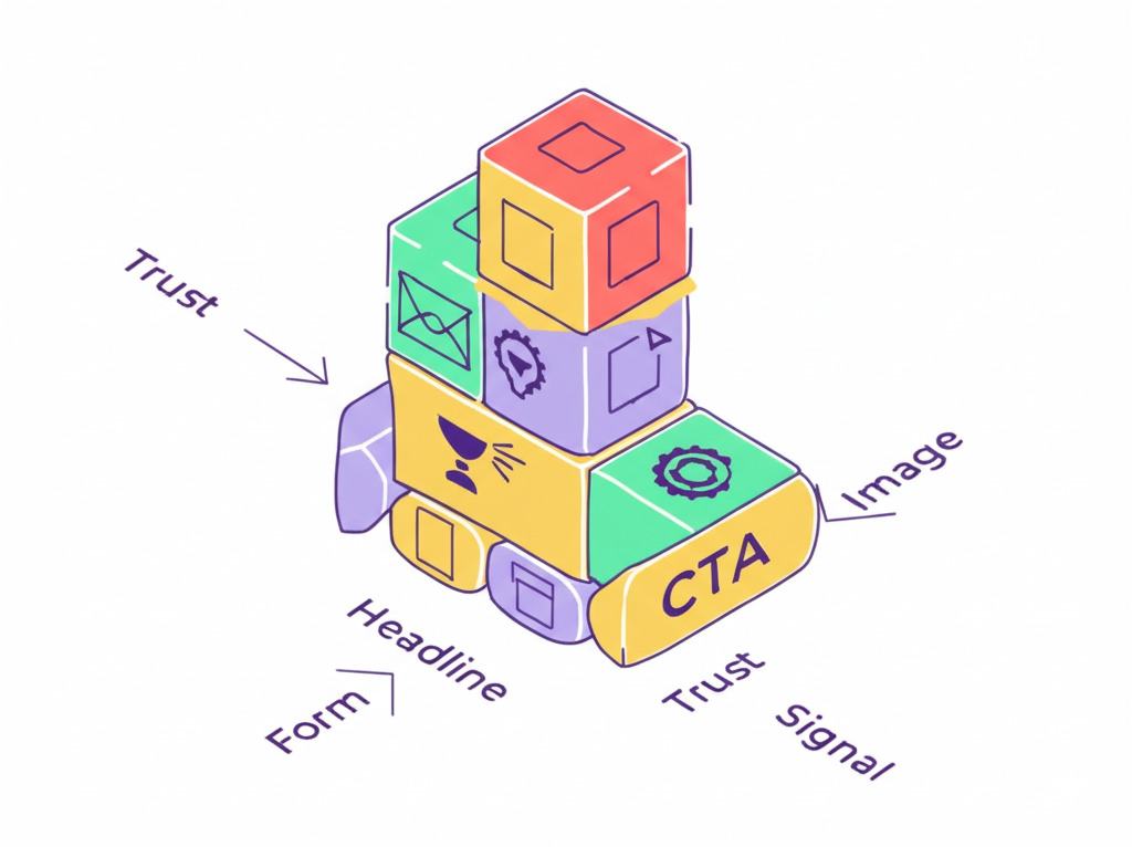
Essential Elements for High-Converting Landing Pages
Optimizing a landing page involves refining several key components. Let’s break down the most critical elements:
1. Compelling Headline
The headline is often the first thing a visitor reads. It must grab attention immediately and clearly communicate the primary benefit or value proposition of your offer, directly relating to the source message (message match!).
Best Practices:
- Clarity over Cleverness: Be direct and easy to understand. Avoid jargon or overly creative phrasing that obscures the core message.
- Benefit-Oriented: Focus on what the visitor gains, not just the features of your product/service. (e.g., “Effortlessly Manage Your Finances” vs. “Finance Management Software”).
- Action-Oriented (if applicable): Sometimes incorporating a verb can be effective (e.g., “Get Your Free Marketing Plan Today”).
- Use Keywords: Reflect the keywords used in the referring ad or search query.
- Keep it Concise: Aim for brevity while conveying the essential information.
- Test Variations: A/B test different headlines to see which resonates most with your audience.
2. Supporting Subheadline
Located directly below the main headline, the subheadline serves to expand on the headline’s message, providing additional context, clarification, or a secondary benefit.
Best Practices:
- Elaborate on the Headline: Provide more detail or reinforce the main point.
- Highlight a Key Benefit or Feature: Offer a compelling reason to continue reading or take action.
- Maintain Clarity and Conciseness: Keep it easy to scan and understand.
- Bridge to the Main Copy: Lead the visitor smoothly into the body text or form.
3. Unique Selling Proposition (USP)
What makes your offer stand out from the competition? Your USP should be clearly communicated, often woven into the headline, subheadline, and body copy. It addresses the visitor’s core need and explains why your solution is the best choice.
Best Practices:
- Be Specific: Avoid vague claims like “best quality.” Focus on tangible differentiators (e.g., “Fastest Delivery Guaranteed,” “The Only Tool with X Feature”).
- Focus on Visitor Needs: Frame your USP around solving their problem or fulfilling their desire.
- Be Prominent: Ensure your USP is easily identifiable on the page.
4. Engaging Visuals (Images and/or Video)
Visuals can significantly impact engagement and conversion rates. They break up text, evoke emotion, demonstrate the product/service, and help convey the message more effectively.
Best Practices:
- Relevance is Key: Use high-quality images or videos that directly relate to your offer and target audience. Avoid generic stock photos if possible.
- Show, Don’t Just Tell: Use visuals to demonstrate your product in action or showcase the results of your service.
- Hero Shot: Feature a compelling primary image (“hero shot”) that captures the essence of your offer.
- Video Power: Explainer videos or testimonials can be highly effective in engaging visitors and explaining complex offers. Keep them concise and professional.
- Optimize for Load Speed: Ensure images are properly compressed and videos are hosted efficiently to avoid slowing down the page.
5. Benefit-Oriented Copy
While features describe what your product/service does, benefits explain how it improves the visitor’s life or solves their problem. Landing page copy should focus heavily on benefits.
Best Practices:
- Translate Features into Benefits: For every feature, ask “So what?” The answer is the benefit. (Feature: “10GB Storage.” Benefit: “Never worry about running out of space for your important files again.”)
- Use Bullet Points: Make key benefits easy to scan and digest using bulleted or numbered lists.
- Focus on the Visitor (“You”): Use customer-centric language.
- Address Pain Points: Show empathy and demonstrate how your offer alleviates their specific challenges.
- Keep it Concise and Clear: Avoid dense paragraphs. Use short sentences and clear language.
6. Social Proof
People are heavily influenced by the actions and opinions of others. Social proof builds trust and credibility by showing that other people value your offer.
Types of Social Proof:
- Testimonials: Quotes from satisfied customers (include names and photos for authenticity).
- Reviews and Ratings: Star ratings or snippets from review sites.
- Case Studies: Detailed success stories.
- Customer Logos: Displaying logos of well-known clients (especially for B2B).
- Number Counters: Showing the number of customers, downloads, subscribers, etc.
- Media Mentions: Logos of publications or media outlets that have featured you.
Best Practices:
- Be Authentic: Use real testimonials and reviews.
- Make it Specific: Vague praise is less effective than specific results-oriented testimonials.
- Place it Strategically: Position social proof near the CTA or areas where visitors might hesitate.
7. Clear and Compelling Call to Action (CTA)
The CTA is arguably the most crucial element. It tells the visitor exactly what you want them to do next. It usually takes the form of a button.
Best Practices:
- Action-Oriented Language: Start with a strong verb (e.g., “Get,” “Download,” “Start,” “Join,” “Request”).
- Specificity: Clearly state what happens when the button is clicked (e.g., “Download Your Free Guide” instead of “Submit”).
- Visibility: Use contrasting colors to make the button stand out. Ensure it’s large enough to be easily clickable, especially on mobile.
- Placement: Place the CTA prominently, often “above the fold” (visible without scrolling), and potentially repeat it further down the page for longer landing pages.
- Create Urgency/Value (Optional): Words like “Now,” “Today,” or highlighting value (“Get Instant Access”) can encourage clicks.
- Test Button Copy and Design: Experiment with different wording, colors, and sizes.
8. Optimized Lead Capture Form (If Applicable)
If your conversion goal involves collecting information (like leads), the form itself needs careful optimization. Every field you ask for adds friction.
Best Practices:
- Ask Only for Essential Information: Minimize the number of fields. Collect only what you absolutely need at this stage. You can always gather more data later.
- Clear Field Labels: Ensure each field clearly indicates what information is required.
- Layout and Design: Use a single-column layout for easier scanning. Ensure adequate spacing.
- Error Handling: Provide clear, inline error messages if a field is missed or filled incorrectly.
- Privacy Assurance: Include a link to your privacy policy and potentially a short statement assuring users their information is safe.
- Button Text: The submit button should follow CTA best practices (e.g., “Get My Free Quote” not just “Submit”).
9. Trust Signals
Especially important for e-commerce or pages asking for sensitive information, trust signals reassure visitors that your business is legitimate and their data is secure.
Examples:
- Security badges (SSL certificates, payment processor logos like Visa/Mastercard)
- Guarantees (money-back guarantee, satisfaction guarantee)
- Privacy policy link
- Contact information (phone number, address)
- Third-party certifications or awards
Best Practices:
- Place Strategically: Position trust signals near CTAs, forms, or payment sections.
- Use Recognizable Symbols: Familiar security logos build instant trust.
10. Page Speed and Performance
Slow-loading pages kill conversions. Visitors expect pages to load almost instantly. A delay of even a few seconds can drastically increase bounce rates.
Best Practices:
- Optimize Images: Compress images without sacrificing quality. Use appropriate file formats (e.g., WebP, JPEG, PNG).
- Minimize Code: Minify HTML, CSS, and JavaScript files.
- Leverage Browser Caching: Store parts of your page in visitors’ browsers for faster loading on return visits.
- Reduce Server Response Time: Choose reliable hosting.
- Limit Redirects: Each redirect adds loading time.
- Use Tools: Test your page speed using tools like Google PageSpeed Insights and address the recommendations.
11. Mobile Responsiveness
A significant portion (often the majority) of web traffic comes from mobile devices. Your landing page must look and function perfectly on smartphones and tablets.
Best Practices:
- Responsive Design: Ensure the layout, images, text, and forms automatically adapt to different screen sizes.
- Tap-Friendly Elements: Buttons and links should be large enough and spaced appropriately for easy tapping.
- Simple Navigation (if any): Avoid complex menus.
- Readable Font Sizes: Text should be easily readable without zooming.
- Test Thoroughly: Use browser developer tools or dedicated mobile testing tools to preview and test on various devices.
12. Minimal Navigation and Distractions
Remember, a landing page has one goal. Standard website navigation (menus, sidebars, extensive footers) provides escape routes that can distract visitors from the desired conversion action.
Best Practices:
- Remove Main Navigation: In most cases, remove the primary website navigation menu.
- Limit Links: Only include links that are essential for the conversion (e.g., privacy policy, terms of service if required) or that support the primary goal.
- Clean Layout: Avoid clutter. Use white space effectively to guide the eye towards the most important elements (headline, form, CTA).
The Ongoing Process: Testing and Iteration
Landing page optimization isn’t a one-time task. It’s a continuous cycle of analyzing performance, forming hypotheses, testing changes, and implementing winners.
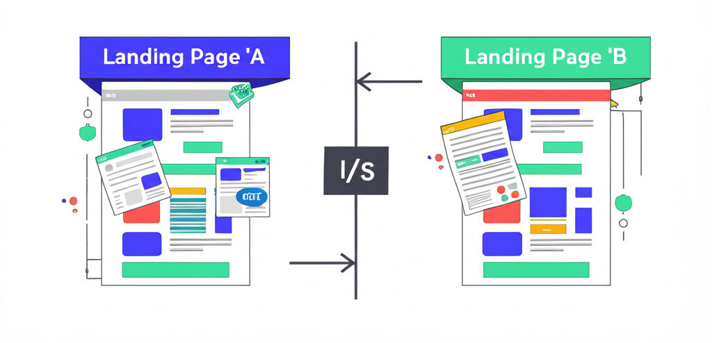
- A/B Testing (Split Testing): Create two versions of your landing page (e.g., with different headlines or CTAs) and show each version to a portion of your traffic. Measure which version achieves a higher conversion rate. Test one element at a time for clear results.
- Multivariate Testing: Test multiple variations of multiple elements simultaneously to see which combination performs best (more complex, requires significant traffic).
- Analytics Review: Use tools like Google Analytics to track metrics like bounce rate, time on page, conversion rate, and traffic sources. Identify drop-off points.
- Heatmaps and Session Recordings: Tools like Hotjar or Crazy Egg show where users click, how far they scroll, and record anonymized user sessions, providing qualitative insights into behavior.
- User Feedback: Consider surveys or feedback widgets to directly ask users about their experience.
Common Landing Page Mistakes to Avoid
- Poor Message Match: Ad message doesn’t align with the landing page content.
- Weak or Unclear Headline: Fails to grab attention or communicate value.
- Multiple, Conflicting CTAs: Confuses the visitor about what to do next.
- Too Many Distractions: Including site navigation or unnecessary links.
- Slow Load Speed: Frustrates users and increases bounce rate.
- Not Mobile-Friendly: Alienates a large portion of potential traffic.
- Long or Intrusive Forms: Asking for too much information too soon.
- Lack of Social Proof or Trust Signals: Fails to build credibility.
- Generic Content: Doesn’t resonate with the specific target audience.
- Never Testing or Optimizing: Assuming the first version is the best it can be.
Unleash the power of digital marketing
Ready to grow your business ?
Conclusion
Landing page optimization is a fundamental discipline for any successful digital marketing strategy. By focusing on the essential elements – a compelling headline and subheadline, clear USP, engaging visuals, benefit-driven copy, social proof, a strong CTA, optimized forms, trust signals, fast loading speed, mobile responsiveness, and minimal distractions – you create a focused environment designed for conversion. Remember that message match is paramount, ensuring a seamless transition from your traffic source to the page. Most importantly, embrace LPO as an ongoing process. Continuously test, analyze, and refine your landing pages based on data and user behavior. By mastering these elements and committing to optimization, you can significantly increase your conversion rates, lower acquisition costs, and ultimately drive substantial growth for your business.
Frequently Asked Questions (FAQ)
What is a good conversion rate for a landing page?
Conversion rates vary wildly by industry, traffic source, offer type, and definition of ‘conversion.’ Averages often range from 2% to 5%, but highly optimized pages in certain niches can reach 10%, 20%, or even higher. Focus on continuously improving your own baseline rate rather than comparing strictly to broad averages.
Should I remove all navigation from my landing page?
In most cases, yes. Removing the main site navigation keeps visitors focused on the single conversion goal. However, you might retain essential links like ‘Privacy Policy’ or ‘Terms of Service,’ often placed discreetly in the footer. Test to see what works best for your specific campaign.
How long should my landing page copy be?
It depends on the complexity of the offer and the stage of the buyer’s journey. For simple offers or low-commitment conversions (like a newsletter signup), shorter copy is often better. For complex, high-consideration products/services, longer copy detailing benefits and addressing objections might be necessary. Always prioritize clarity and scannability (use headlines, bullets, visuals).
How many Call-to-Action (CTA) buttons should I have?
While the goal is singular, you might repeat the same CTA button multiple times on a longer page (e.g., once above the fold and again near the bottom) so it’s always accessible as the user scrolls. Avoid having multiple different CTAs asking the user to do different things, as this causes confusion.
What’s the difference between a landing page and a homepage?
A homepage is like the lobby of your website – it’s designed for general exploration, caters to multiple audience segments, and has many links/navigation options. A landing page is like a specific meeting room – it’s built for a single campaign, targets a specific audience segment, and has one clear conversion goal with minimal distractions.
How often should I A/B test my landing page?
Continuously, if possible, especially for high-traffic pages. Run one test at a time until you reach statistical significance (enough data to be confident in the result). Once a test concludes, implement the winner and start planning your next test based on new hypotheses.
Can I use video on my landing page?
Absolutely! Video can be highly effective for explaining complex offers, demonstrating products, or featuring testimonials. Ensure the video is high-quality, relevant, concise, and doesn’t significantly slow down page load time. Consider providing a text alternative or summary for those who prefer not to watch.